(This post was originally published on Red Hat Middleware Blog. To read the original post,
click here.)
Since I've changed role and started performing architect duties, I have to draw more boxes and arrows than write code. There are ways to fight that, like contributing to open source projects during sleepless nights, POCs, demos, but drawing boxes to express architectures and designs is still big part of it. This post is about visualising distributed messaging/SOA/microservices applications in agile (this term has lost its meaning, but cannot find a better one in this case) environments. What I like about the software industry in recent years is that the majority of organisations I've worked with, value the principles behind lean and agile software development methodologies. As long as it is practical, everyone strives to deliver working software (rather than documentation), deliver fast (rather than plan for a long time), eliminate waste, respond to change, etc. And there are management practises such as Scrum and Kanban, and Technical Practises from Extreme programming (XP) methodology such as unit testing, pair programing, and other practises such as CI, CD, DevOps to help implement the aforementioned principles. In this line of thinking, I decided to put together a summary of the design tools and diagrams I find useful in my day to day job while working with distributed Systems.
Issues with 4+1 View Model and death by UML
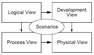
Looking back, I can say that most of the diagrams I've seen around are inspired by 4+1 view model of Philippe Kruchten which has Logical, Development, Process and Physical views.
 |
| 4+1 View Model |
Diagram applicability
Typically these views are expressed through UML, and for each view, you have to use one or more UML diagrams. The fact that I have to use 15 types of UML diagrams to communicate and express a system architecture in an accessible way, defeats its purpose. |
| Death by UML |
Another big drawback is that the existing UML diagram types are primarily focused on describing object-oriented architectures rather than Pipes and Filters architectures. The essence of messaging applications is around interaction styles, routing, data flow rather than structure. Class, object, component, package, and other diagrams are of less value for describing a Pipes and Filters based processing flows. Behavioural UML diagrams such as activity and sequence get closer, but still cannot express easily concepts such filtering and content based routing which are fundamental part of integration applications.
View applicability
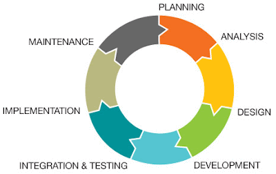
Having different set of views for a system, to address different concerns is a great way of expressing intend. But the existing views of 4+1 model doesn't reflect the way we develop and deploy software nowadays. The idea that you have a logical view first, which then leads to development and process view, and those lead to physical view is not always the case. The systems development life cycle, is not following the (waterfall) sequence of requirement gathering, designing, implementing and maintaining. |
| Software Development Lifecycle |
Practical Visualisation for Integration Applications
C4 is also not an exact match for middleware/integration applications either, but it is getting closer. If we were to use C4 model, then system context diagram would be one box that says ESB (or middleware, MOM, microservices) with tens of arrows from north to south. Not very useful. Container diagram is quite close, but the term container is so overloaded (VM, application container, docker container) which makes it less useful for communication. Component and class diagrams are also not a good fit as Pipes and Filter architectures are focused around Enterprise Integration Patterns, rather than classes and packages.
So at the end, what is it that worked for me? It is the following 3 types of diagrams which abbreviate as SSD (not as cool as C4): System Context Diagram, Service Design Diagram and Deployment Diagram.
System Context Diagram
 |
| System Context Diagram |
Service Design Diagram
 |
| Service Design Diagram |
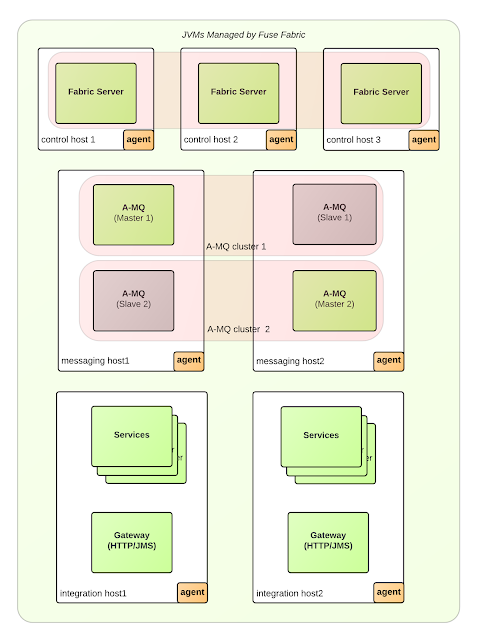
Deployment Diagram
 |
| Deployment Diagram |
What tools do I use?
- Mac OS: OmniGraffle with icons from graffletopia.This is what I've used to create all the diagrams for Camel Design Patterns book.
- Windows: Enterprise Architect by Sparx Systems with EIP icons by Harald Westphal. There are also MS Visio Stencils here.
- Web: LucidCharts which ships EIP icons by default. That is the easiest to use tool and accessible from everywhere. It is my favourite tool (with MS Visio import/export options for Windows users), and has free account plans to start with.
- Web: DrawIO another web tool with EIP icons. The beauty of this tool is that it forces you to use your own storage options for the diagrams, such as: google drive, dropbox, locally, etc. So you own the diagrams and keep them safe.
- Canva: not specifically for EIP diagrams, but in general this site has a nice templates and photos to use in various presentations. Check it out.
- Red Hat JBoss Developer Studio
- EIP Designer by Sirius
- Talend Open Studio for ESB
- Hawtio - the Camel plugin can visualize running Camel routes as EIP diagrams.
System Context Diagram is useful to show the system wide scope and reach of the services, Service Design Diagram is good for describing what a service does, and Deployment Diagram is useful mapping all that into something physical. In IT, we can expand work and fill up all the available time with things to do. I'm sure given more time, we can invent 10 more useful views. But w/o the above three, I cannot imagine myself describing an integration application. As Antoine de Saint-Exupery put it long ago: "Perfection is finally attained not when there is no longer anything to add but when there is no longer anything to take away."


0 comments:
Post a Comment